Automated Cooking Machines Revamped

Overview

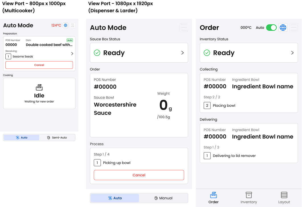
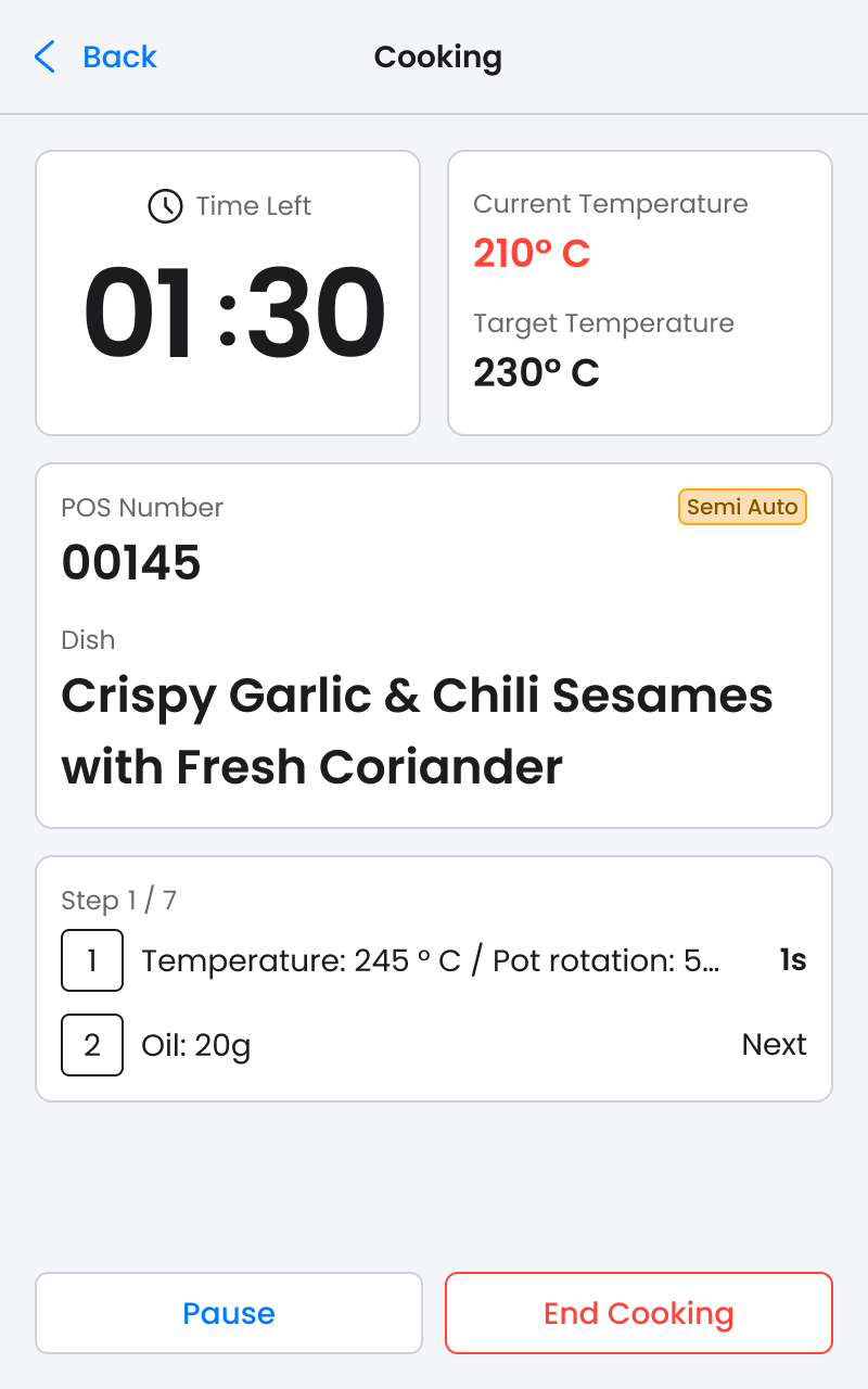
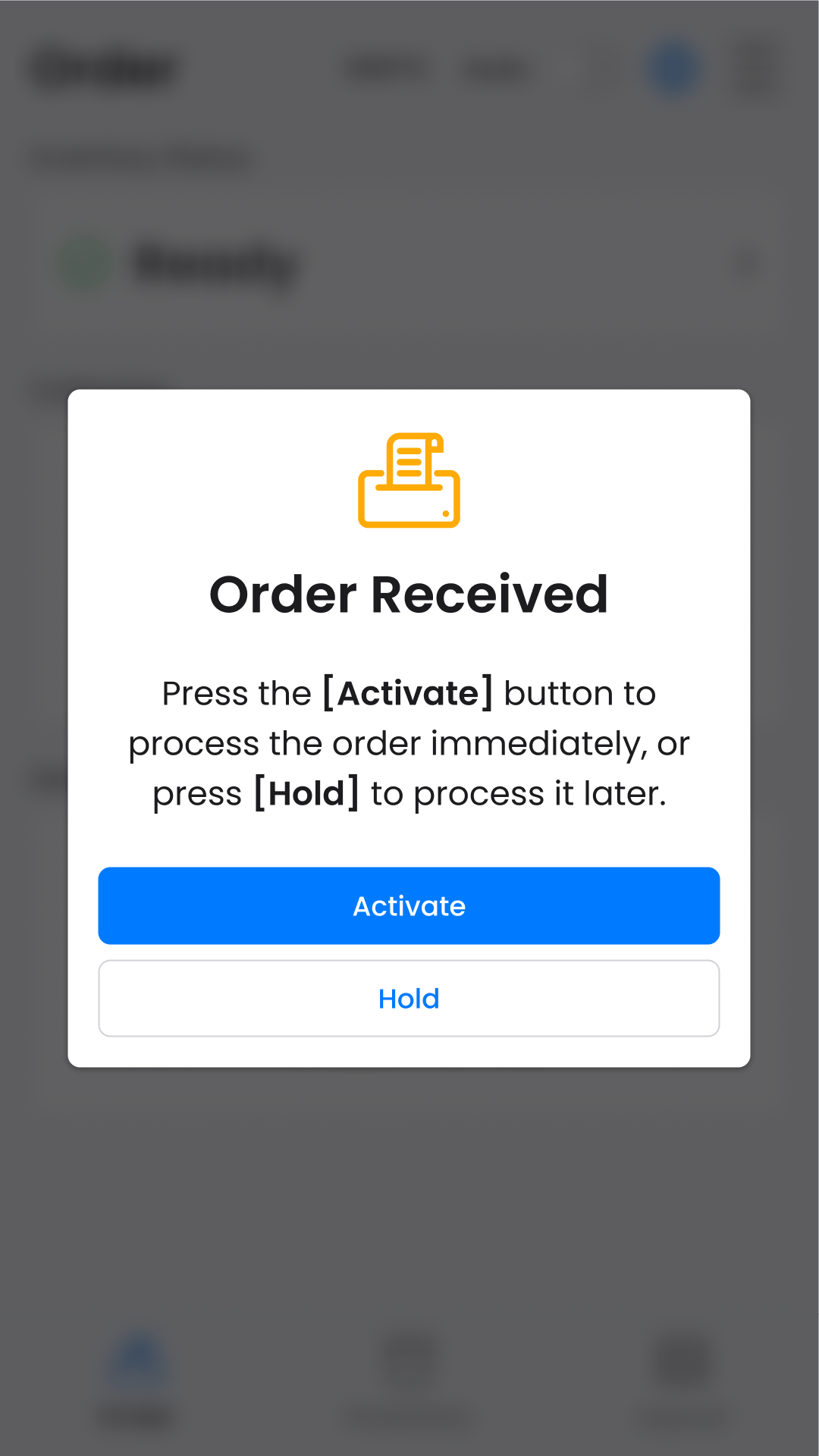
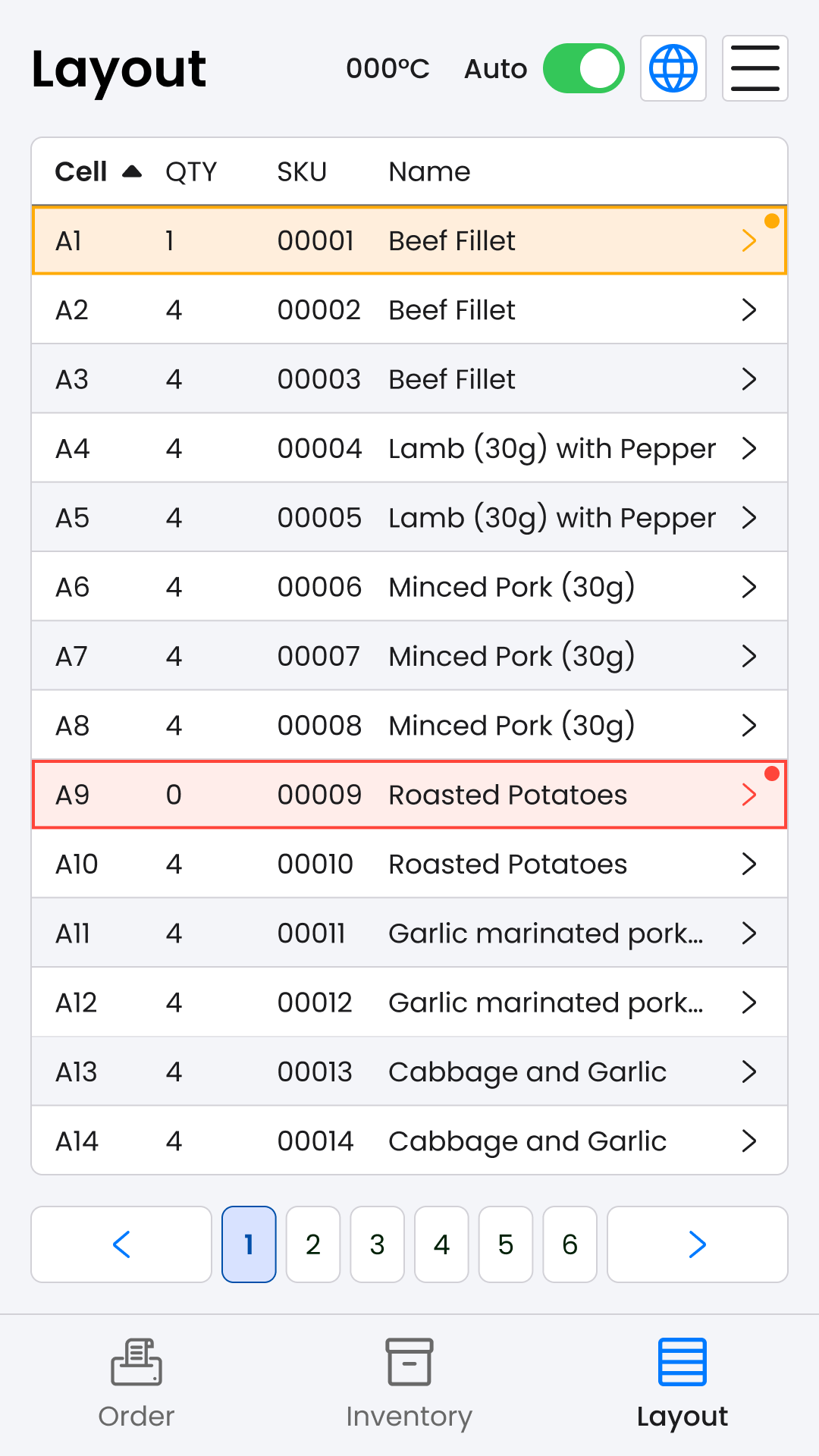
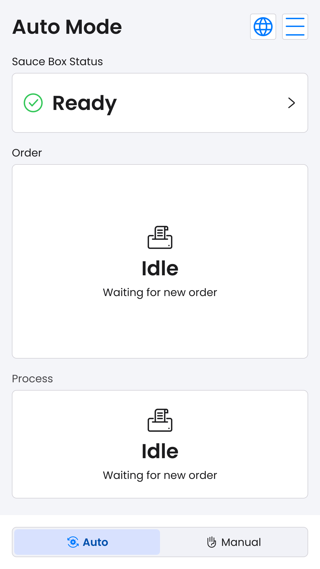
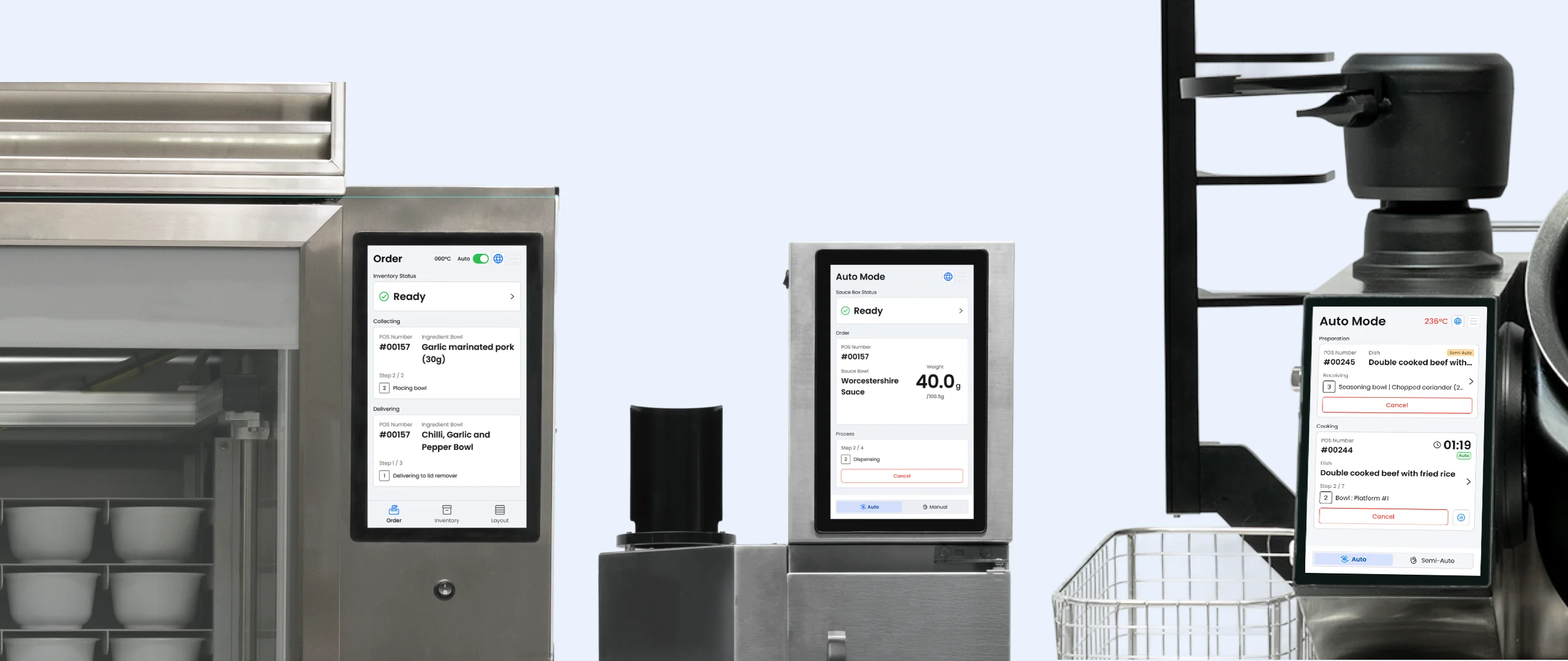
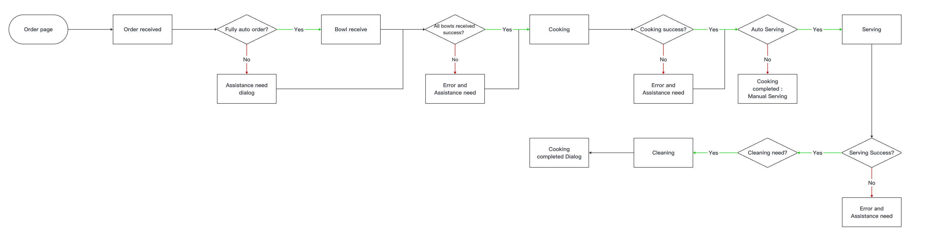
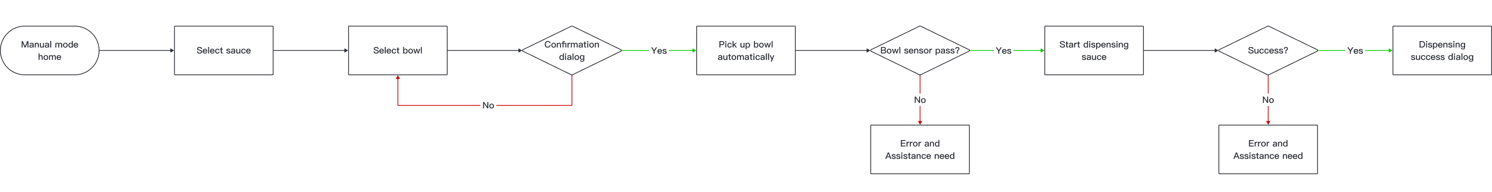
Hestia Pro provides a fully automated cooking solution for restaurant kitchen operations through 3 machines: Multicooker, Dispenser, and Larder.

Company:

Hestia Technology Limited

My Roles:

UX/UI Designer

My Deliveriable :
  • Redesigned UX/UI for Multicooker, Dispenser, and Larder control panels
  • Web App SAAS Platform (Applicable to Mobile, Tablet and Browser)
  • Establish Design system for consistent visual and functional experience

Team:
  • 4 Developers
  • 1 UX/UI designer
  • 1 CTO

Time:

2024

Software:

Figma

Design process (How I work)

Objective & Goals

  • Unify the design system across v6 product line for a consistent user experience.
  • Simplify the SAAS platform with an intuitive, responsive design to reduce the learning curve.
  • Streamline recipe creation and editing on the SAAS platform by reducing number of clicks.
  • Enhance user satisfaction for the v6 machines and SAAS platform through user-focused improvements.

Pain Point & limitation

  • Inconsistent Design Systems: Lack of a unified design across products creates a fragmented user experience.
  • Complex Recipe Creation: The web-based SAAS platform’s complicated process (go through 3 tabs) and high learning curve demand chefs have basic computer skills.
  • Unintuitive Machine UX: Cooking machines lack user-friendly design, e.g., difficulty finding sauces quickly (unfiltered scrollable long list )and updating inventory one cell at a time (81 cells total).
  • Unclear POS Order Tracking: Users struggle to monitor current POS order progress, hindering operational efficiency.

HMW Statement

"HMW streamline the visual and interaction design to align all machines interface under a unified design language?"

"How might we optimize the usability of the machine interface to allow chefs or operators quickly locate and prepare needed ingredients, and handle repetitive tasks?"

Solution

  • Develop a Comprehensive and Standardised Design System for different Viewport (SAAS Platform) and Cooking Machine.
  • A Continuous and Intuitive for Ingredient and Recipe Creation flow in SAAS Platform
  • Recipe Record function on Cooking Machine and seamless transfer to the SAAS Platform.
  • Intuitive Filter function on Sauce Dispenser and Multi Inventory Update Process Flow designed in Larder,
  • Organised and Clear Progress status and reminder to reduce navigation barries.

Persona

User flow

Multicooker Cooking flow
Dispenser Manual mode flow
Larder Replenishment & inventory update flow

Understanding Needs: The Research Process

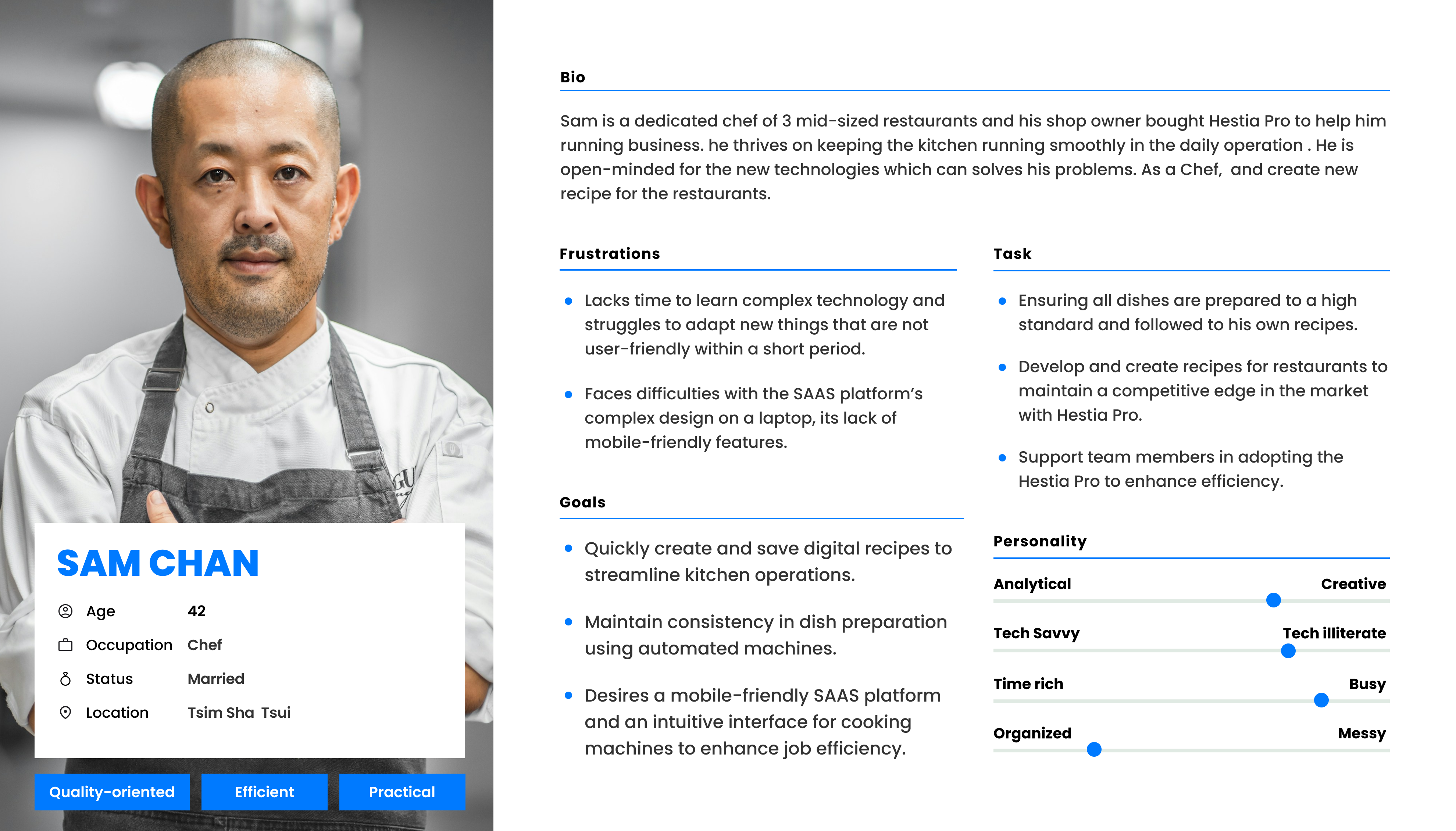
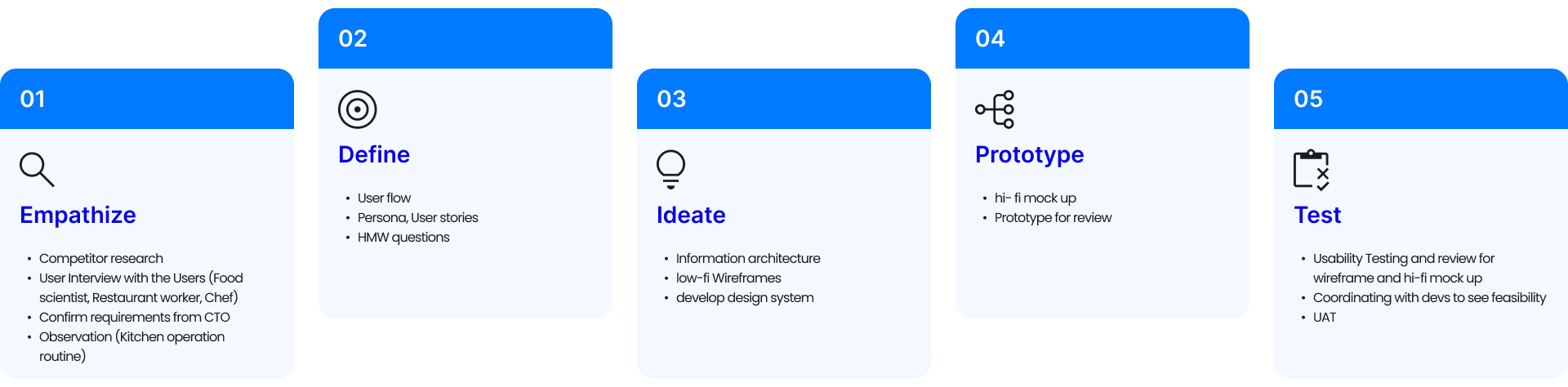
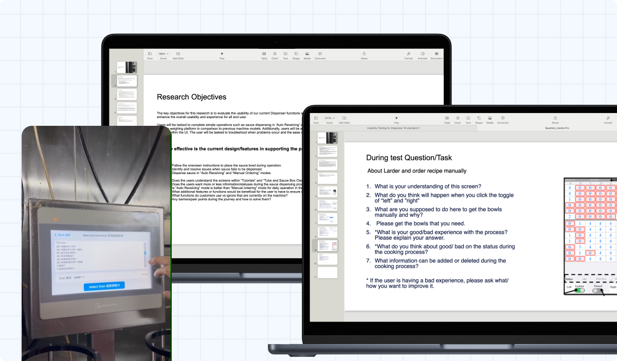
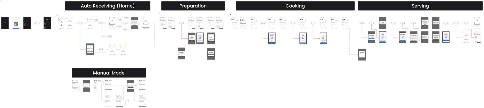
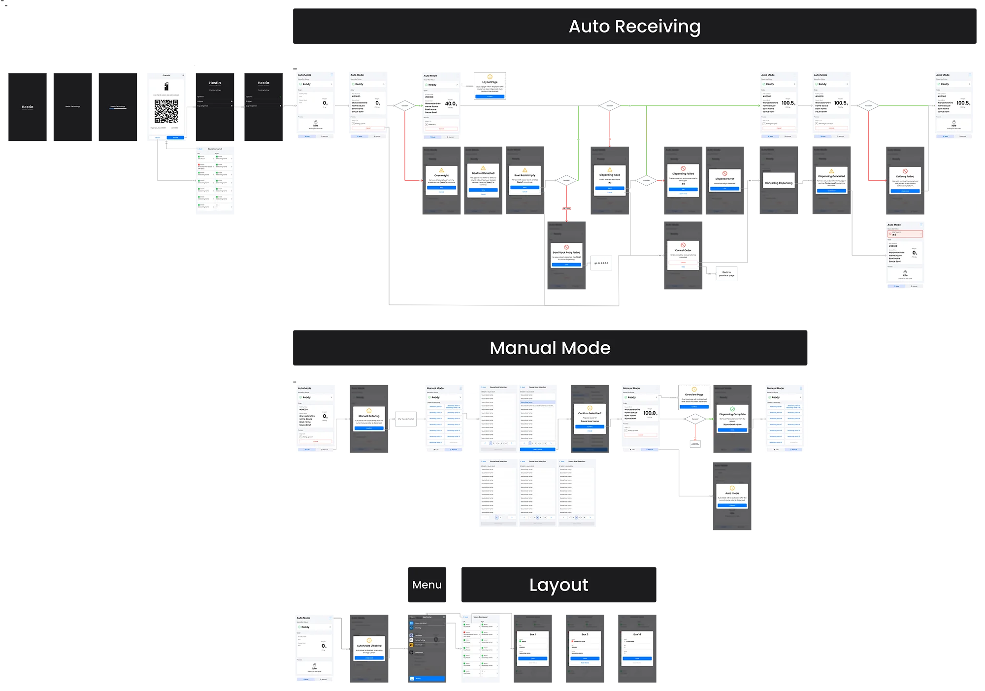
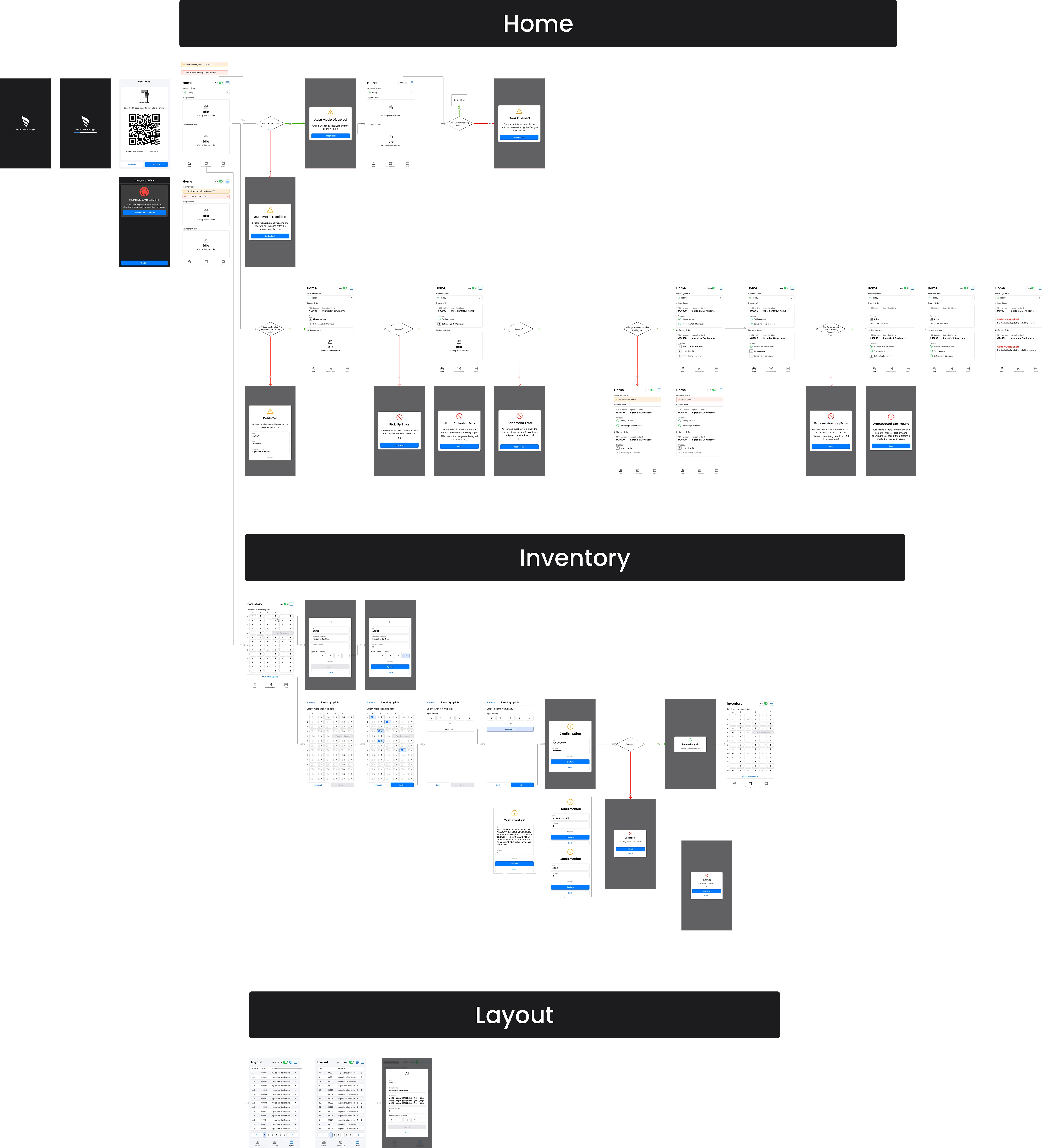
Before designing the wireframe and Pass the design to develop, I engaged in deep discovery work with our user:

  • User Interviews: i spoke with the kitchen operator, food scientist team to identify pain points, and customization requirements.
  • Observation: I observed the Chef and kitchen operator heir workflows, and how they interacted with the Hestia Pro product line.

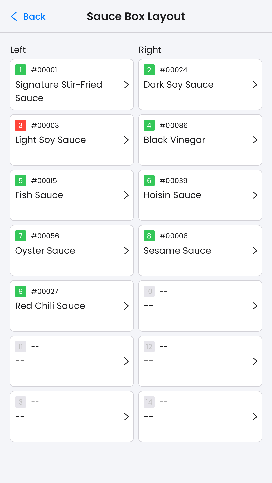
From those researches, we found that users typically wanted four levels of customization and needs:

  • Easy to use and navigate:  Number of click is key in kitchen area, especially in peek hour.
  • Clear information layout:  Intuitive process display and action need to be done must be clear.
  • Fast and easy recipe creation: Mobile friendly is important, no space for laptop in the kitchen.
  • Minimize repetitive tasks: Limited preparation time, Ingredient and stock management are conducted during non-peak hours only,
Document and photo of user Interview to identify the pain point of current product line

Wireframe

Multicooker cooking mode wireframe

Dispenser main function wireframe

Larder main function wireframe

Usability Testing

2

Usability testing

6-8

Interviewees each test

Key Topic To Find Out

  • How effective is the new design to support the users complete core tasks (eg, Replenish bowls, Encounter Error) in the daily kitchen operation with Hestia Pro?
  • Does the process, status and information of the order and the instructions of handling errors are legible to the user?
  • How intuitive and quickly can user navigate and locate the inventory level and ingredients while using the Hestia Pro product line?

Insight & Feed Back

  • 75% of interviewees informed that the process, status and information of the order were easily and clearly understandable.

    - 60% of interviewees said they only focus on which order are processing, the status bar and the current step of the order.

    - However, 38% of the interviewees said the size of the inventory status bar need to be bigger and more prominent.
  • 100% of interviewees who experienced the previous Hestia Pro line said, the filter sauce ingredients paged is easily located and found the needed sauce.
  • 87% of interviewees successfully finished multi-cell update flow without assistance

Issue solution

1.Enlarged status bar and Simplified the process status

  • Improved Readability at a Distance: Larger text and streamlined design ensure better legibility, even from afar, enhancing usability in busy kitchen environments.
  • Enhanced Order Progress Visibility: Displaying only the current steps in the progress section provides a more intuitive and faster view of order status.
  • Optimized Space Usage: This approach frees up space to enlarge the status bar and order name—key user priorities—improving focus and clarity.
Dispenser Auto mode :  Testing design (left) and Revised (right)
Larder Auto mode :  Testing design (left) and Revised (right)

2. Sauce Category Selection System in Dispenser Manual Mode

  • Menus that are more intuitive and user-friendly: Manual mode selection menu only display the assigned seasoning sauce in the restaurant first, and select the needed sauce bowl (v6) rather than display all created sauce bowl at the beginning.(old version)
Dispenser Manual Selection

3. Single and multi-cell inventory update in Larder

  • Time saving and quick update flow :The multi-cell update feature in Larder version 6 enhances operational efficiency by minimizing the need for repetitive single-cell updates, thereby streamlining the daily restaurant operations.
  • Clear Information display and Intuitive single cell update: Bowl ingredient details added in the two-click single cell update, helping operators in bowl preparation during inventory replenishment.
Single and Multi-cell inventory update flow in Larder

4. Streamlined cleaning procedure that request less human interface and mechanical operation in multicooker

  • Simpified 50% interface and mechanical operation steps: By automating intermediate processes, operator are only required to manage the initial setup and final steps, thereby allowing them to allocate more time to other critical kitchen cleaning tasks.
  • Enhancing SOP Usability:  Including images of mechanical components with clear and straightforward instructions greatly improves understanding and execution of cleaning procedures, thereby reducing errors and speeding up training.
Streamlined cleaning procedure in Multicooker

Design System

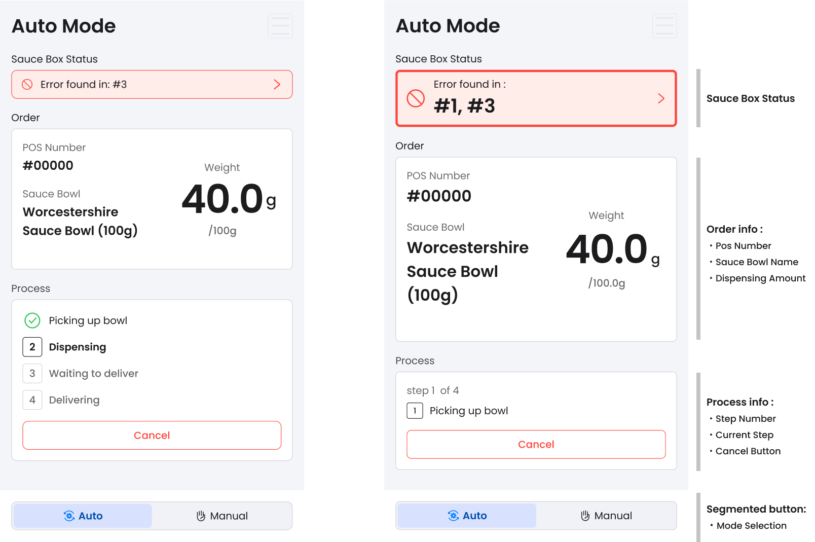
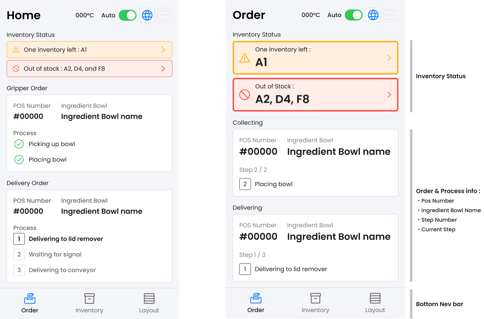
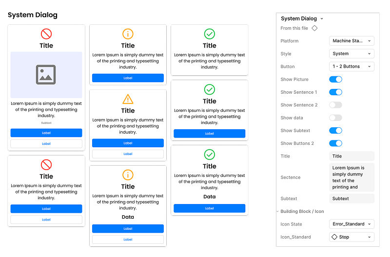
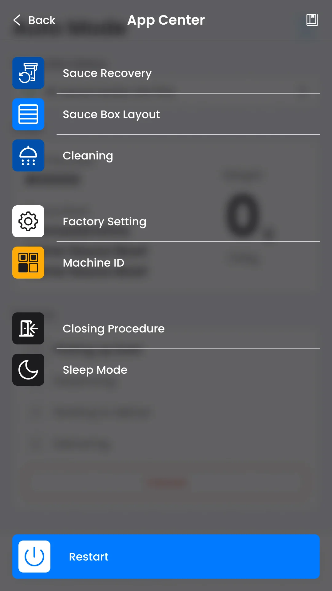
The global brand guidelines lacked clear product design instructions, resulting in significant UI differences across the three machines and making it difficult to convey they were produced by the same company.

Therefore, establishing a design system resolved the issue, and it should be,

  • Customizable

    component variations can be configured directly in the Figma variant panel. Centralized management of boolean and text properties allows seamless configuration of all states from one location.
Dispenser Auto mode :  Testing design (left) and Revised (right)
  • Responsive & Adaptive

    All components scale fluidly across every major viewport — Multicooker (800px x 1280px), Dispenser and Larder (1080px x1920px), ensuring consistent, high-quality UIs at any products.

  • Prototyping-Ready

    Every component ships with fully documented interactive states and micro-interactions in prototypes. This creates realistic, high-fidelity demos that help stakeholders quickly understand and evaluate the design vision.

Final Design

Multicooker :  Auto mode Cooking flow screen
Larder :  Dialog Design, Layout page and Factory Setting
Dispenser :  Idle Design, Layout page and App Center Menu

Key Metrics

32%

Time saving in Cleaning Process

56%

Reduction in number of click in inventory update

75%

Reduction in number of click in inventory update